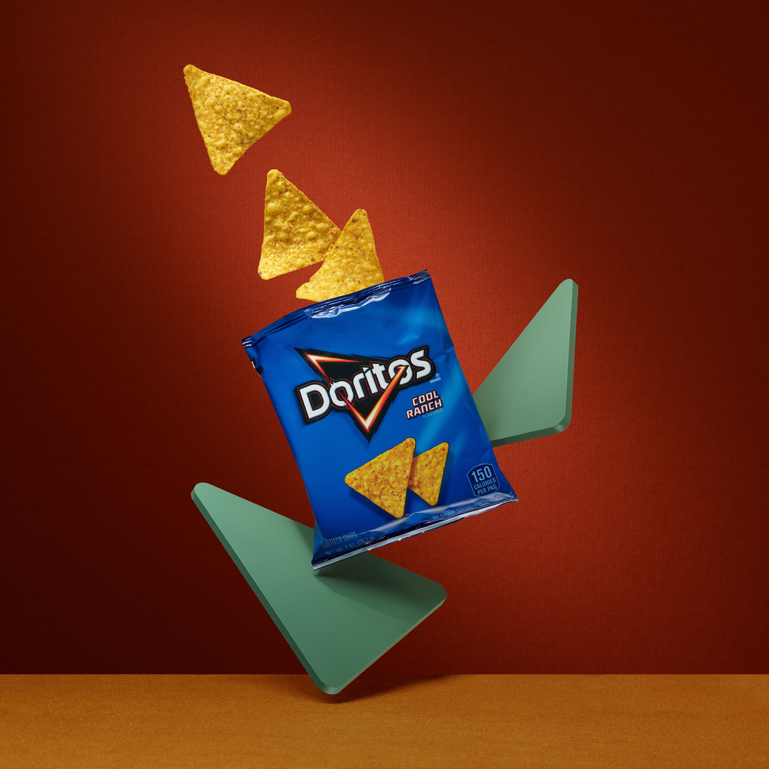
How can you make an interesting video of a still product? I've taken up the challenge of adding movement through colorful lights and shifting the focus. Everything comes together in an eye-catching, playful video that's perfect for social media.
Doritos Bag
When I have some free time, I enjoy expanding my portfolio with new imagery. Recently, I decided to take on the challenge of capturing the essence of a simple item, like a small bag of Doritos, in a playful and creative way.
Lowercase Glasses
Video doesn’t have to be over the top, sometimes a small amount of movement is all you need. First I captured a high resolution photo with a still camera, then I switched over to a video camera to capture the video.
Lighting for both still and video used to be more complicated. Video requires continuous lights, in the past that would require HMI or tungsten lights. Now that the LED light market has exploded, there are tons of great options that work for both photos and video.
I was very happy to be showcasing Lowercase glasses, which are made in New York City. Now that I’m done photographing them, they will become my everyday glasses.
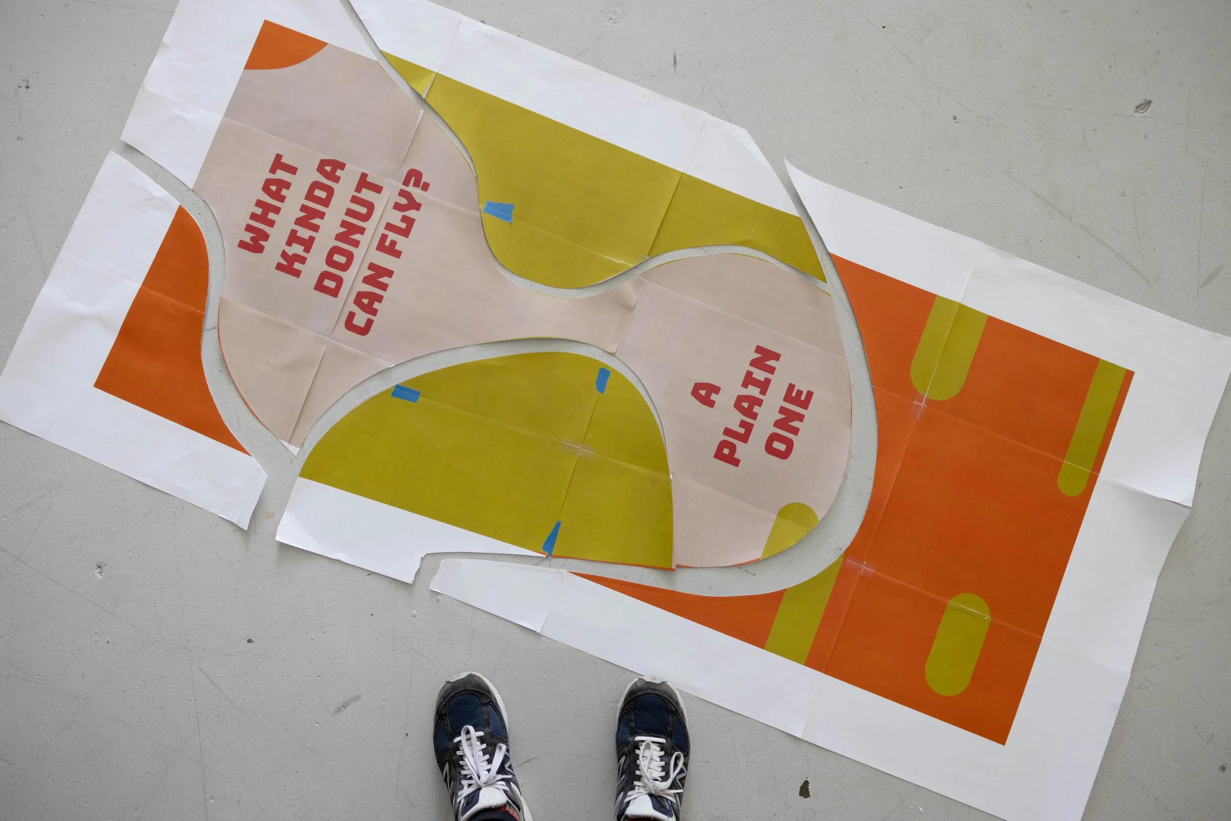
Donut Joke
I love donuts and I love jokes, why not combine the two? It was as fun to make the set elements for this video as it was designing it.
And of course I had lots of donuts leftover. No wonder I love shooting donuts!
I created the initial design in Adobe Illustrator, then tile-printed it at 100% ( it was over 5 feet long!) with tabloid sheets of paper. I then used the large print as a template to cut the fabric and lay everything out in the right spot.
Boom Chicka Pop
I love creating custom sets for a product. For this set I added a little motion and a soundtrack to go with the Boom Chicka Pop microwave popcorn. I’ve also added a behind-the-scenes photo of the set.
Oatly Oat Milk
I was inspired by the playful cut-out shapes on the Oatly package art. I referenced shapes and elements from the packaging to create a playful scene with literal cut-outs! I’ve included a behind the scenes photo to show what the set looks like. It was a lot of fun.
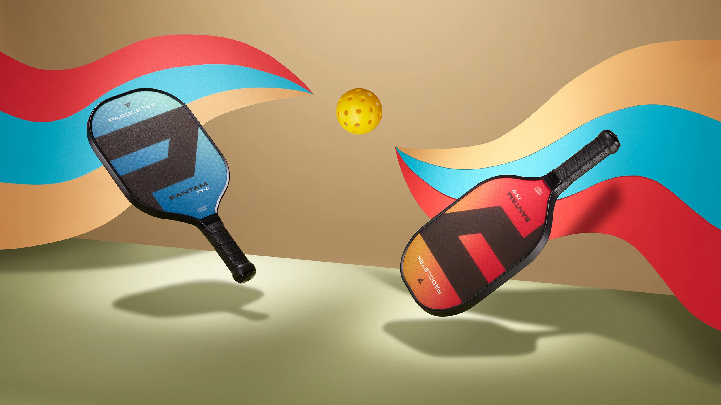
Pickleball
I’ve only known about Pickleball for about a year, but it’s been around since the late '60s. Today, Pickleball, a hybrid of tennis, badminton, and ping-pong, is the fastest-growing sport in America.
For this new portfolio image, I wanted to reflect on its heritage with a playful color scheme. I created two swirls out of paper to convey the movement of the ball as it’s volleyed back and forth. The composition and lighting also aim to create a youthful, energetic and joyful impression.
Sport images often show an ideal athlete, striking for peak performance and results. My intention here was to share the vibrant energy and humor which make Pickleball such a popular and addictive sport.
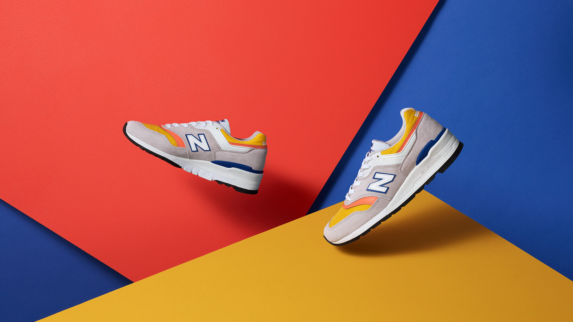
Colorful Shoes
I was excited to photograph these vibrant and cheerful New Balance shoes. I knew the image should reflect their playful energy. I used planes of color inspired by the shoes to create the composition. Initially, I had white behind the yellow and orange, but I ultimately swapped it for a bright blue paper which helped everything pop.
Millie Lottie
Millie Lottie has taken totes to the next level. Jan Hammock, the owner of Millie Lottie, wanted to show that these bags were more than just a stylish tote bag and that they had clever features to make transporting foods much easier.
I worked with Jan to create simple sketches in a storyboard format showing the different camera angles I would use and what action would be taking place in each shot. I had to think about what the finished video would show and how it would piece together in editing. I needed to highlight the individual parts of the interior of the bag and how it simplifies bringing food to a pot luck or picnic.
Breaking Mirrors: On Set With The Profoto Pro-10
I was given a chance by Samy's Camera here in San Francisco to test out the new Profoto Pro-10 power pack (say that ten times fast). It is an excellent power pack with lots of cool features.
For this test, I was most interested in the flash duration. The test subject needed to be fun yet also demonstrate how well the Pro-10 can stop motion. Breaking glass ranks pretty high on the fun scale and is an excellent way to test freezing action.
Rather than clear glass, I dropped a mirror because it can reflect color, adding some unpredictability and creativity to the photo. A tent was built of seamless colored paper for the mirror to reflect. The dropped mirror was captured right after it had bounced off the ground and shattered still keeping its shape. When the mirror broke, each piece of glass reflected a different color from the paper tent, creating a mix of color shapes.
There was, of course, some testing to achieve the right timing and delay setting of the trigger before breaking the first mirror. To capture the mirror in focus (and to add to the superstitious nature of the shoot) I photographed at f13. The fastest flash durations of the Pro-10 are at the lower power settings. I used a flash duration of 1/45,000 (2.2) for the main head and 1/26,000 (4.2) for the head that was lighting the color paper. Both measurements are using the t.5 method and illustrated in this chart from Profoto:
Each mirror drop was captured by 3 different cameras, each at various angles. In the end, I only ended up using two of the camera angles.
If you've used any of the newer Profoto strobes, B1, B2, or D2, you'll be instantly familiar with the menus and interface of the Pro-10. The pack itself is very refined. If you need to photograph a splash of liquid or explosion of some kind, you'll need a fast flash duration. The Pro-10 definitely provides that.
I'm very pleased with how the images turned out. They are quite beautiful, well worth earning years of bad luck for smashing mirrors!
Here's a behind the scenes video: https://www.periscope.tv/peter_belanger/1lDGLRVjyaRxm?t=3s
Gallery Of Shoes
Recently I’ve been receiving more requests for shoe photos in my portfolio. I’ve decided it was time to embrace my love for shoes and create whole gallery of shoes. I've added some new photos from ideas that have been brewing. Shoes have such a personality, which makes them fun to photograph.
Below are two photos from the new gallery coupled with behind the scene photos.
Flower and Film
I had an idea for a stop motion piece bubbling around in my head for some time. It was very loose and incomplete but fate presented me with the exact things I needed to tie it all together, a box of old slides and prints. These were recently given to me by a family member and there's more nostalgia than in the images alone. Holding and viewing the chrome slides and seeing the old way we used to capture, view, and appreciate images was great fun. It made me reflect on how photography has changed. This stop motion piece uses the old media as props and to create a color palate. Much the way a latent image would become visible as it soaks in developer in a darkroom, this image comes to life before the viewer's eyes. To complete this effect we worked in reverse.
Little piles a sawdust were placed for each frame of the stop motion.
Slivers of the frame were cut off and small pieces of the flower print were ripped away after each shot. The final video shows the framed photo appear from nothing. This took a while to create but I'm very happy with the final piece.
Sightglass
It was nice to have the opportunity to work with Kyle and Geoff again. They aren’t strangers to my blog. A search for Dwell on my site will most likely reveal a photo of them. This time we worked to revamp e-commerce photos for Sightglass, an independent coffee company in San Francisco.
Our goal was to capture the products in a consistent way so the photos would family well together. We didn’t want the camera angle to jump around so we chose to photograph everything from the same perspective. This meant, for instance, that coffee filters and patches couldn’t just lie flat on the table. Instead we posed them in the same vertical positions as coffee cups. We will repeat this approach when new items are added in the next few months so that they will still family with the first photos. Moreover, the files were delivered with transparent layers. This will allow Sightglass to use the images on white as well as off-white backgrounds.
Now go buy something at Sightglass.com.
Exploratorium and SF Magazine.
The Exploratorium in San Francisco has moved in to a new location that's going to make it one of the biggest attractions in the city. San Francisco Magazine asked me to capture a couple of photos of the new location before it opens. The museum's crew spent a day moving construction materials and equipment out of the way just so I could get a clean shot. It is a beautiful new space for the museum. I knew I wanted a soft light to showcase the building.
We were shooting other areas inside the building when I noticed the sun outside was how I envisioned it would be to capture an exterior photo. We rushed outside and got this shot just in time!
This is my favorite image they used for the spread (plus a behind-the-scenes photo). The magazine is on newsstands now and also
.
Hanging with Bikes
I love bikes, especially well designed and functional urban bikes and accessories. Naturally, I was excited when Dwell approached me to photograph some beautiful bike gear. The idea was to photograph 3 bikes hanging on colored backgrounds. Normall...
Read MoreThe Brokenmusicbox Full Album
The cover for the single, "We Will" was a teaser for the full album???which I'm excited to say is out in it's full glory. The music, design and photography have all come together in harmony to form an exciting album. How was it all done?? We met wit...
Read MoreEditors' Choice
The latest issue of Macworld Magazine gave me the chance to use my new 100-400mm lens. San Francisco is the perfect city for it! Every neighborhood has a view. It is crazy how many tourists come and go to famous landmarks. They take their photo an...
Read MoreMacworld January Cover
The iPhone 4s has been unleashed all over Macworld Magazine, inside and out. The cover may look nice and clean but the set to light it was a mess. If you're traveling for the holidays, load your iPad up with the Zinio version or look for the analo...
Read MoreEames: The Architect and the Painter
About a year ago (November 2010) Dwell magazine hired me to photograph a bunch of cool chairs. Of course one of the chairs was a requisite Eames chair. Dwell had asked if a film crew could come by my studio as well since the editor of the magazine...
Read MoreRed, Red, Red
San Francisco Magazine approached us with a fun idea for "The Trend" section of the December 2011 issue. They wanted to incorporate the color red in an over-the-top fashion. They provided a selection of red products to pick from to form the groups...
Read More


