To contrast the first set of images I captured for Illumina, we created a simple background with just a hint of warmth. Even with this simple setup, the sequencing machine really stands out.
Illumina - Part One
I had the pleasure of working with Illumina to capture images of their new sequencing machine. Their creative team did an incredible job shaping the creative direction, and having a custom-built set in the studio made everything feel so much more authentic.
Abbott
I worked with Abbott to capture some images of their FreeStyle Libre system. We worked over 3 days, capturing images that tell the story of how the product is used, along with images of the product alone. Both the solo photos and the people photos work well together because we kept the lighting and styling similar.
On the technical side, the photos of FreeStyle Libre alone are more complex than they seem to capture. There are two versions: one the size of a penny and the other the size of a quarter. To get the image all in focus, I used focus stacking, combining 30 to 40 images taken at different focus points to create one in-focus photo.
Fitbit
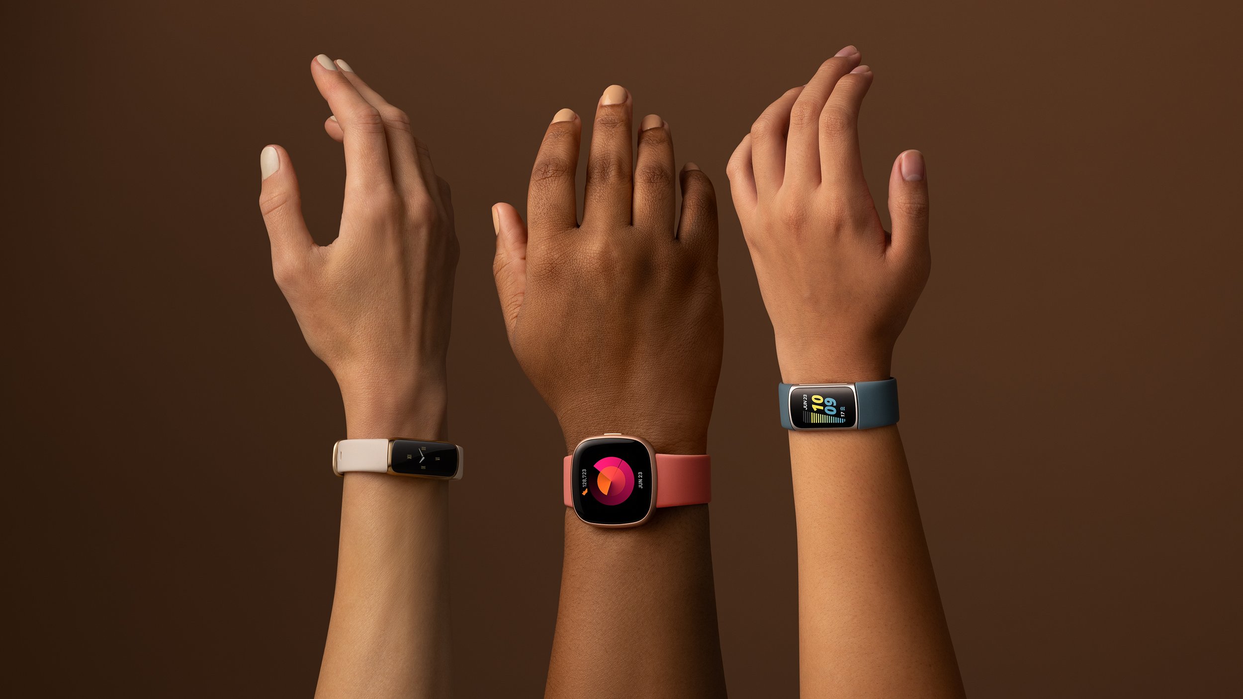
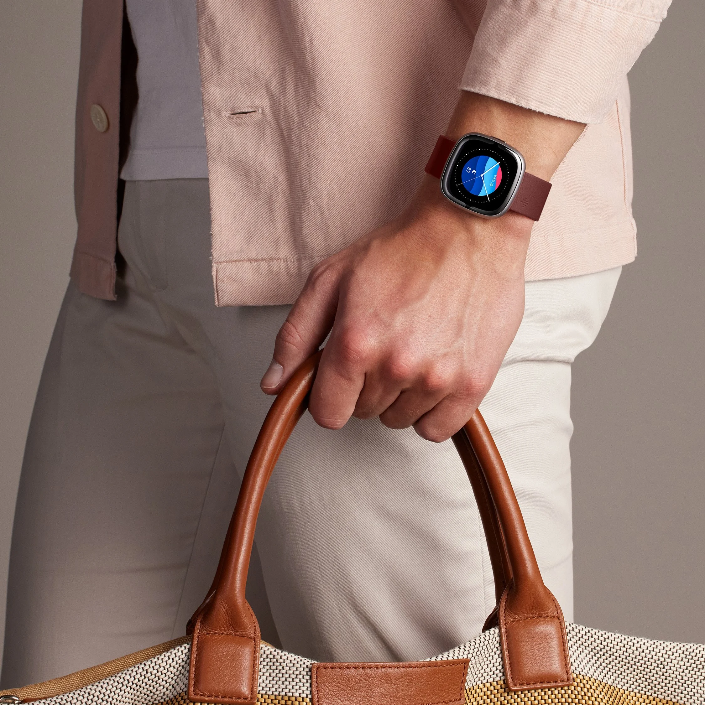
Collaborating with the industrial design lead on Fitbit watches, I captured a series of images. The aim was simple: emphasize both the visual appeal and practical versatility of these products. The resulting photographs offer a clear depiction of how these watches seamlessly adapt to various user activities.
eBay Sneakers
The shoes are the star of the show in these images for eBay. The series was part of a campaign promoting the purchase of collectible footwear on their platform. The idea was to keep things simple, highlighting the shoes to appeal to collectors and fashion enthusiasts.
Fitbit Sense 2
I’m excited to share some photos I captured with Fitbit of their new Sense 2 smartwatch.
Lowercase Glasses
Video doesn’t have to be over the top, sometimes a small amount of movement is all you need. First I captured a high resolution photo with a still camera, then I switched over to a video camera to capture the video.
Lighting for both still and video used to be more complicated. Video requires continuous lights, in the past that would require HMI or tungsten lights. Now that the LED light market has exploded, there are tons of great options that work for both photos and video.
I was very happy to be showcasing Lowercase glasses, which are made in New York City. Now that I’m done photographing them, they will become my everyday glasses.
Says Chair
Sometimes bringing motion into a product video can be challenging, but in the case of the Sayl Chair by Herman Miller it was fun to let the chair spin and capture the natural movements. I wanted to showcase the details of the design and materials (by Fuseproject).
New Balance 990v2 Video
Version two of the New Balance 990. Unlike my previous New Balance video which is up and close and examines the details of the shoe, this one is a little more playful and pulled back.
New Balance 990 Video
I’m a huge fan of New Balance. I was excited when a tan version of the 990 came out. Originally created in 1982 they have stood the test of time and are still made today. I’ve created an up-close video to pay homage to their exquisite design and unique characteristics.
Cionic Lifestyle Photos
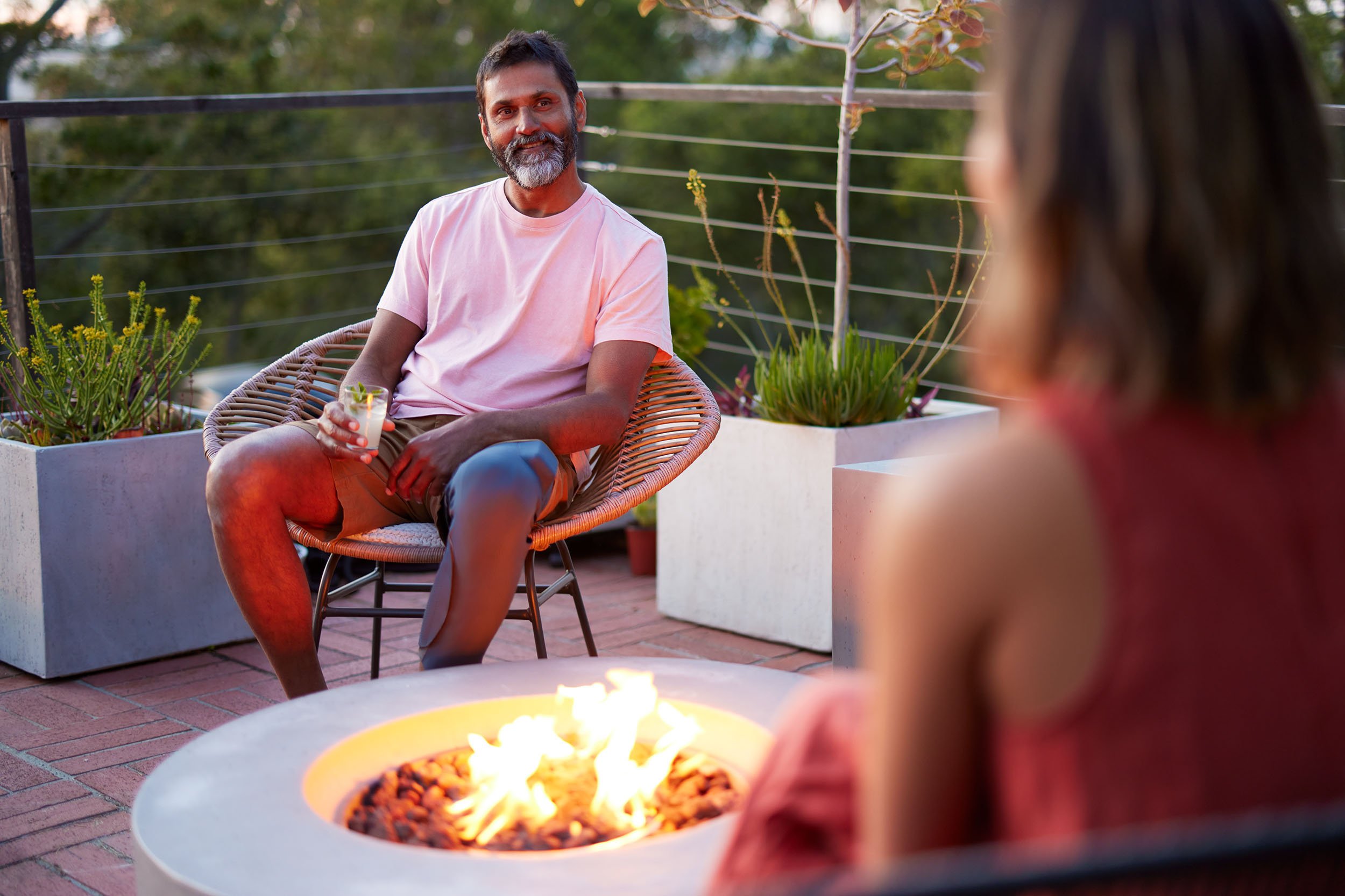
In my previous post I showed the photos of the Cionic Neural Sleeve that I captured in the studio. In addition, Cionic wanted to capture lifestyle photos to accompany the studio shots. The goal was to capture the images as the sun was going down. This gave us a small window of time to work with, so in anticipation we created a detailed shot list and scouted the scenes and lighting the week before. Fortunately we had beautiful weather and it all came together smoothly.
Cionic Neural Sleeve
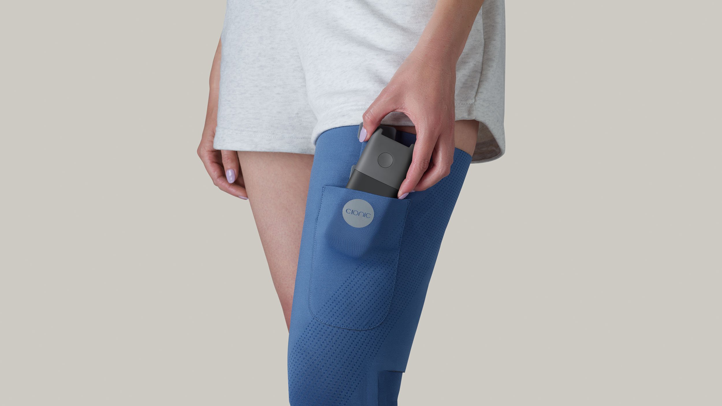
I worked with Fuseproject and bionic startup, Cionic, to capture photos for the launch of their neural sleeve. The Cionic Neural Sleeve is a first-of-its-kind healthcare product which improves ease of walking for those living with multiple sclerosis and other neuromuscular diagnoses.
Our first round of photos was to captured photos in the studio that illustrate how the product works and the process of donning and doffing the sleeve.
Donut Joke
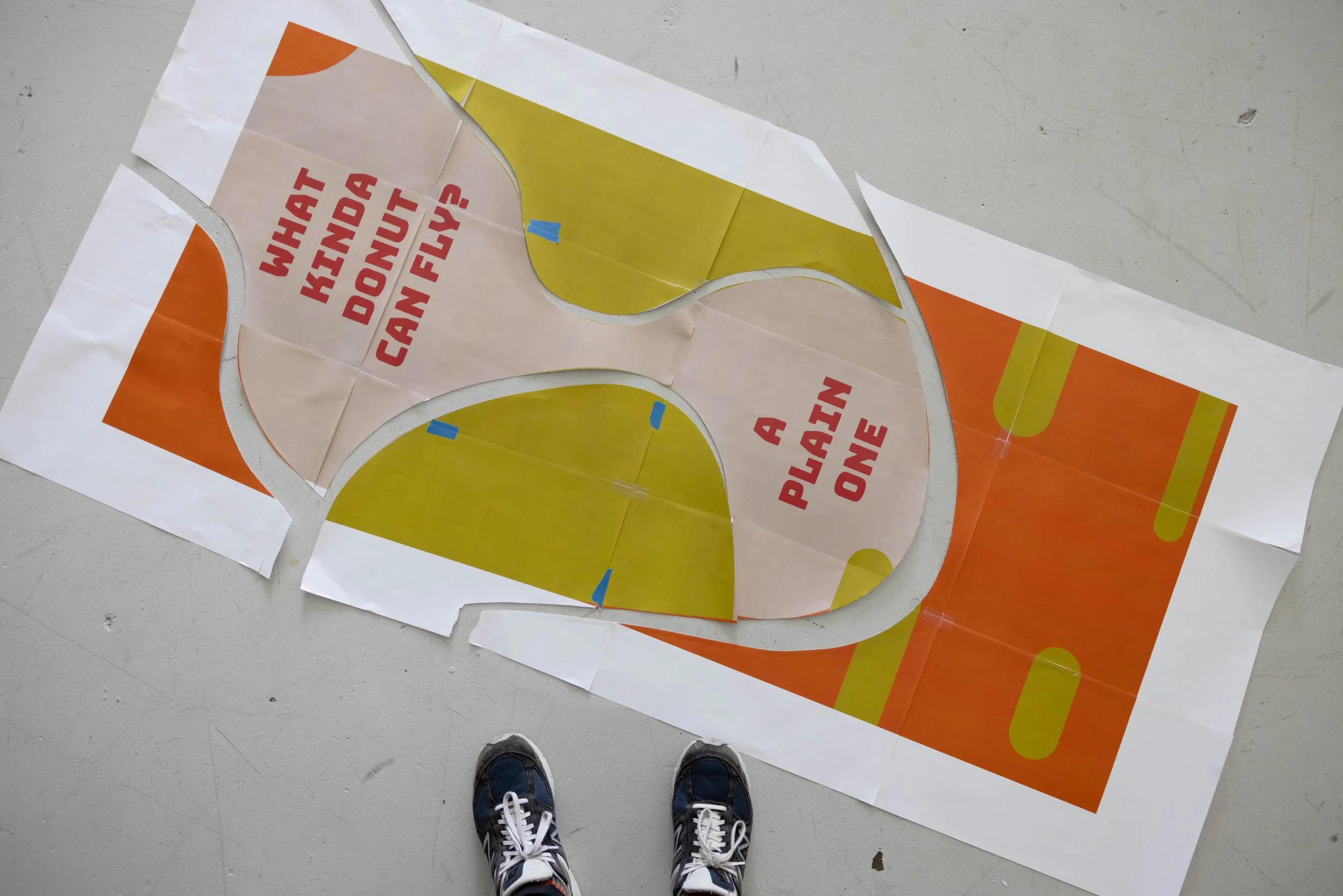
I love donuts and I love jokes, why not combine the two? It was as fun to make the set elements for this video as it was designing it.
And of course I had lots of donuts leftover. No wonder I love shooting donuts!
I created the initial design in Adobe Illustrator, then tile-printed it at 100% ( it was over 5 feet long!) with tabloid sheets of paper. I then used the large print as a template to cut the fabric and lay everything out in the right spot.
Boom Chicka Pop
I love creating custom sets for a product. For this set I added a little motion and a soundtrack to go with the Boom Chicka Pop microwave popcorn. I’ve also added a behind-the-scenes photo of the set.
Oatly Oat Milk
I was inspired by the playful cut-out shapes on the Oatly package art. I referenced shapes and elements from the packaging to create a playful scene with literal cut-outs! I’ve included a behind the scenes photo to show what the set looks like. It was a lot of fun.
Pickleball
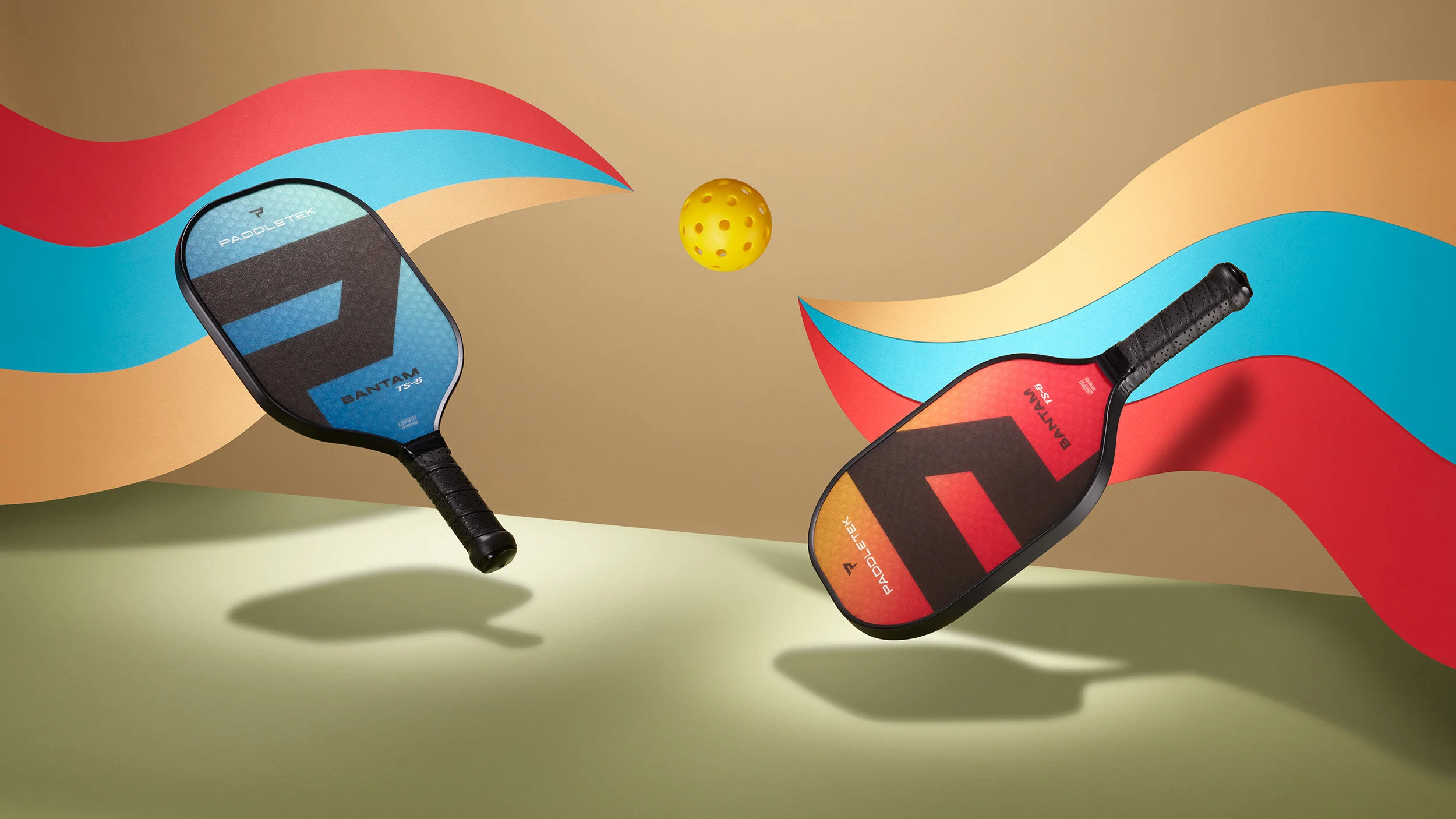
I’ve only known about Pickleball for about a year, but it’s been around since the late '60s. Today, Pickleball, a hybrid of tennis, badminton, and ping-pong, is the fastest-growing sport in America.
For this new portfolio image, I wanted to reflect on its heritage with a playful color scheme. I created two swirls out of paper to convey the movement of the ball as it’s volleyed back and forth. The composition and lighting also aim to create a youthful, energetic and joyful impression.
Sport images often show an ideal athlete, striking for peak performance and results. My intention here was to share the vibrant energy and humor which make Pickleball such a popular and addictive sport.
Sayl Chair
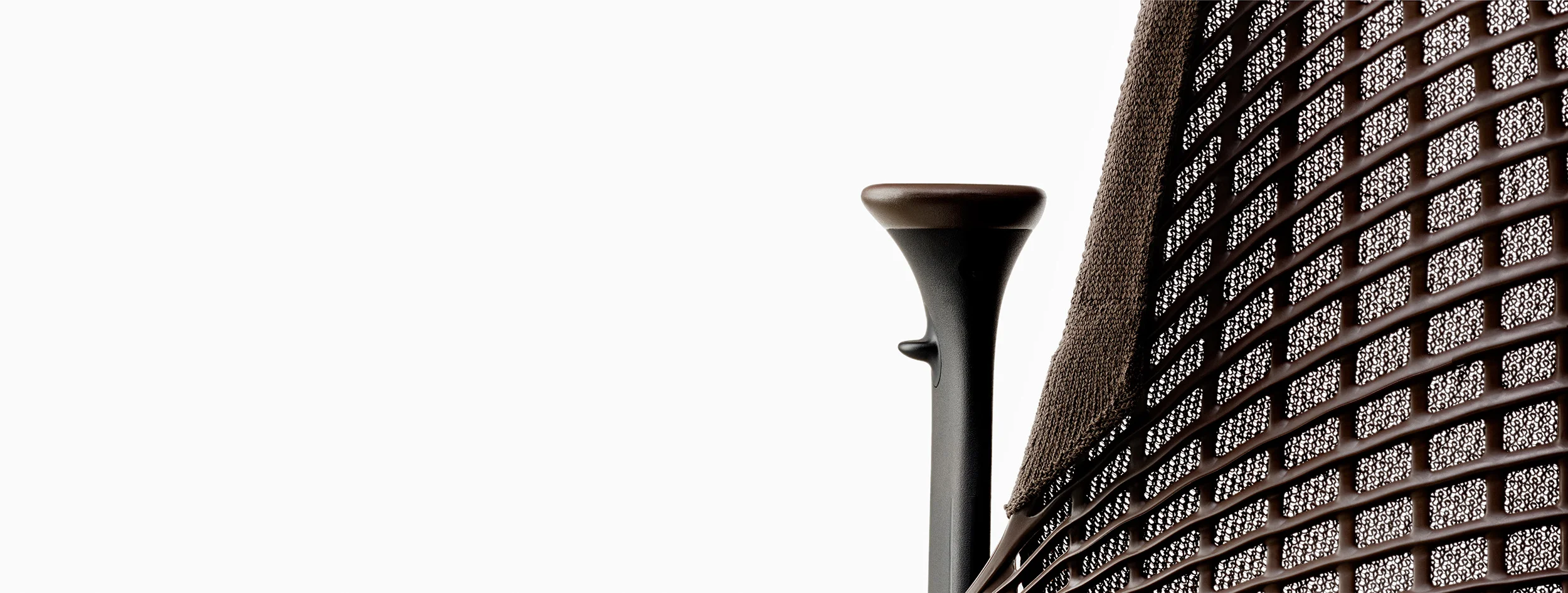
The Sayl chair by Herman Miller has simplified and advanced the desk chair in so many ways. I worked with the chair designers to photograph a new feature of the chair: a fabric back cover. This provides an added level of customization for the user. The goal of this project was to show how the fabric worked with the chair and showcase the color options.
The beauty of the design is that the fabric doesn’t hide the structure’s frameless suspension system. The loose weave of the fabric allows the chair’s back to show through. This quality was something we wanted to capture in the still photos. The stop motion piece allows the viewer to see the chair's shape from all sides as well as demonstrating how many colors combinations there are.
Color
How light reacts to something isn’t always predictable, especially with colored lights. Matte, shiny, and reflective areas all react differently to the incoming color light. The golf clubs I shot recently had all of these types of surfaces in a very small area. I need to think about the finishes as I’m lighting. Finding the right balance between the colored light and neutral light is also important. Using a similar color on the background helped create the feeling that the subject and background are connected and exist in the same space.
Computer History Museum
I was contacted by the Computer History Museum in Mountain View to use a photograph of mine in one of their exhibits. The subject of the show is the iPhone — it's history and impact on the world. It's a celebration of the 10th anniversary of the release of the iPhone.
At the initial release I was photographing the event and caught this shot of Steve Jobs gazing into the treasure-like case that held the first generation of the iPhone.
The museum features the photo in a display that is in their lobby. It was great to see how they curated the exhibit. I can't believe it's been 10 years!
Kala Eyewear
It is amazing how something as simple as a pair of glasses can completely change your look, whether you wear them everyday or just when the sun is out. I wear glasses by necessity and really appreciate a well-crafted pair. That is one reason I love Kala Eyewear. Their glasses are made by hand here in the Bay Area which is another reason. I got the chance to photograph two styles: Twiggy and Mick. Each pair is a piece of art with the potential to transform individuals. I wanted to showcase them as such so I built simple risers to create a graphic scene which would highlight the design and quality details. See their whole collection here: kalaeyewear.com


